- Dropdown to switch between Music, Video and App libraries is confusing for the average user.
- The narrow rows of songs in the list view with small text isn’t legible
- There are two highly distinct styles of design within iTunes — the list based library view and the more modern grid based iTunes Radio view
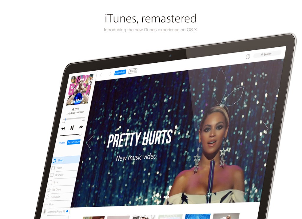
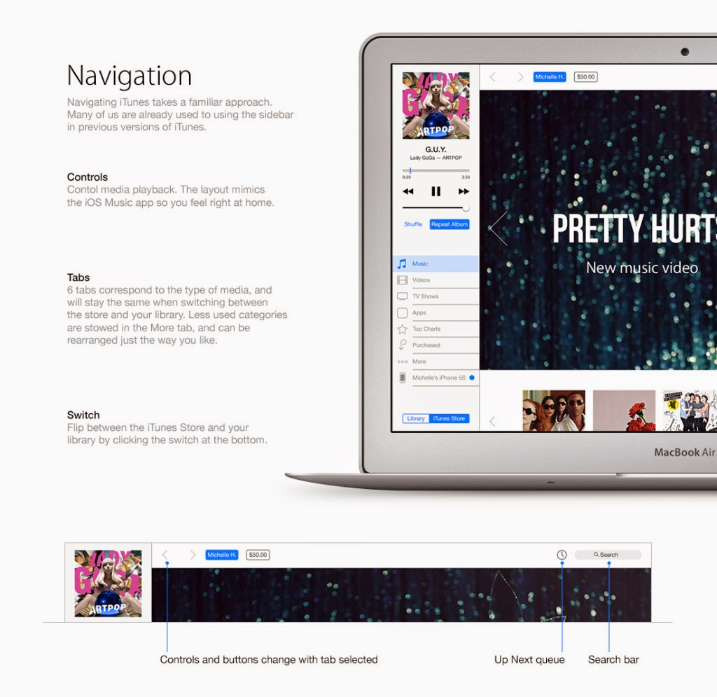
Brye’s concept focus on a new iTunes design with a flat look, a better store, a more readable library view and improved navigation.
The library view, earlier a simple linear list, is an alphabetically grouped list in the concept:
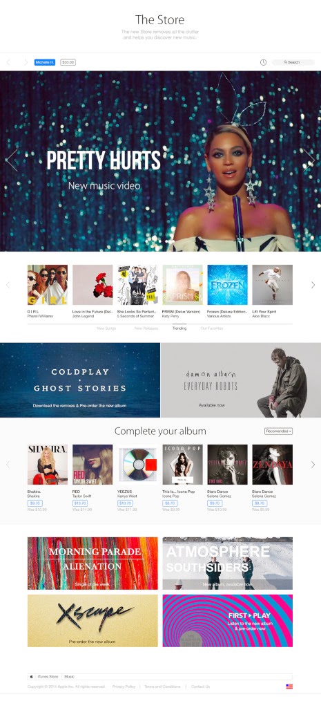
The iTunes Store features a simplified design, with a less complex information hierarchy, big banners, and of course flattened buttons and other UI elements:
The device management screen is redesigned too, with the storage bar featuring flatter colors, and Find my iPhone and iCloud accessible right from within this window.
iTunes has been as it is from a long time and it really need to be fully redesigned with iOS 7 support. There has been a lot of feature creep in iTunes, with unrelated functionalities like the App Store, device management, app library etc. being crammed in what was once a music player.
[via kurocha]


