Right now we are going to show you a quick comparison between iOS 6’s UI view and iOS 7’s UI view, but what’s the point from making such comparison ? Well the UI view gives you the ability to see a high level overview on the scope of the visual changes occurring with iOS.
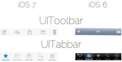
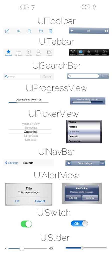

The comparison pictures is made by the developer MPOW who tweeted these above and below pictures where he compares between iOS 6’s UI view and iOS 7’s UI view…
The image compares common elements like the toolbar, tabbar, searchbar, switches, sliders, and much more. It’s a great way to appreciate some of the widely seen visual changes happening with iOS. If you happen to be a developer, or are at least interested in what it takes to create an app on iOS, you’ll especially appreciate this. Take a look inside for the full image.
As you can see iOS 7 looks so different and more simpler, and that’s my opinion, look at the UISlider for example in iOS 7 it looks gorgeous and I really love it..
So what do you think ? Are there any elements from iOS 6 that you still prefer over the new iOS 7?
Share your thoughts with us in our comment section below…