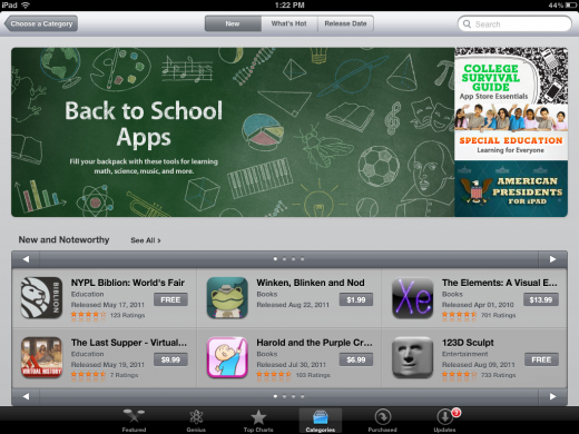
In conjunction with the to-die-for enhancements to the new iPhone 5 , Apple appears to be introducing a new style as well for the App Store page for categories mimicking the look of the home page. The new look has already appeared in the Education category in addition to the Games category while others remain in one of two older styles.
The new category home pages feature a large horizontal banner that displays a few choice apps in primary position. The banner, just like the home page does, scrolls through the selections.
The App Store page new design matches the category pages to the look of the rest of the iTunes stores giving a more unified look. It does, however, limit your ability to easily view all new apps in the category, yet displaying the “New and Noteworthy†and “What`s Hot†more prominently.
The new design is also live on the iPad version of the App Store, still only in the Education and Games categories so far. On the iPad, the ‘What’s Hot’ section is replaced with ‘Staff Favorites’.
Till that moment, it`s not clear if these changes are temporary or permanent, but the odds are the changes will include the other categories.
Via: [Source1]
If you found this post useful, dont forget to click the +1 button Below


