We all must admit that there is a big difference between OS X Mavericks and the newly introduced OS X Yosemite. Today Pixelapse has posted a group of images that shows the difference between the UI of OS X Yosemite and OS X Mavericks.


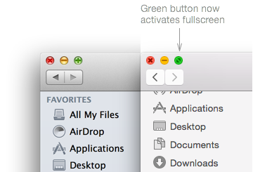
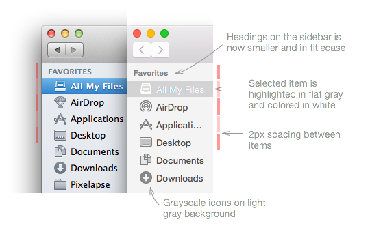
Apple revealed a sneak peek into Mac OS X Yosemite earlier this week. Not surprisingly, Apple updated its desktop OS to match iOS 7’s design language. The new OS X now embodies a brighter and flatter styling, coupled with icon updates, font changes, and translucent materials. Here’s a quick look at the visual design changes in Yosemite and my impressions of them.
So shall we start ? Here’s some screenshots that shows the UI of OS X Yosemite and Mavericks, enjoy..
See there is many great changes that makes the new software looks perfect, I guess this is the best word I can say it.
What about you ?


