But it looks like the voices in the latter camp are just the loudest, and don’t necessarily represent the majority. Because according to this online poll conducted by Input Factory’s Polar platform, most folks actually prefer the overall UI design of iOS 7 to that of iOS 6…

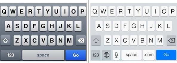
According to a new report from 9tomac who pointed to the Polar survey, which is actually a number of smaller surveys asking users which UI elements they prefer, those in iOS 6 or iOS 7. This includes on/off switches, pickers, alerts, sliders, search, the share sheet, the Lock screen, and the Notification Center.
And here’s how users have voted thus far:

As you can see, an overwhelming majority of folks who voted preferred the look of iOS 7 UI elements to those in iOS 6: 72% to 28%.
Now, you can argue that these results aren’t indicative of how the general population feels—and you’d be right, iOS 7 isn’t publicly available yet. But in the same breath you could argue that it’s not just developers using the betas right now, which evens the playing field a bit.